The ultimate in antique furniture: Marie Antoinette’s drawing room in the Petite Trianon. The chairs, the settees, the lanterns – are all so gorgeous – as is the pink and white fabric. The floor is Parquet de Versailles, a pattern that is still copied today. Install some Wi-Fi and I’d be quite happy here!
This year I have been compiling and posting a list of the Top Ten Design Elements that I think help create a beautiful room. These elements are what makes an interior interesting, exciting – a place that when you enter it, you have to stop and catch your breath from the sheer surprise and beauty of the room. Of course, this is a very personal list. All design aficionados have their own ideas of what they feel makes up a desirable and beautiful room. Perusing photographs of rooms that I love, a certain look or style is repeated over and over. These interiors are the ones that draw me in, time and time again: they are more casual, livable, cozy, inviting and warm. To date, the Cote de Texas Top Ten List of Design Elements includes:
Linen
Slipcovers
Seagrass
Curtains
Light fixtures
Wall decor
The item next added to the list is antiques. This is a complicated issue and somewhat misleading because the “antique” might actually be a reproduction. A reproduction can play as important a role in decor as a true antique because it is the shape and lines of the piece of furniture that give it its classic appeal, not necessarily its age. Adding to the confusion, the “antique” as a design element may not even be a piece of furniture, it can be an accent, an accessory, or even a building material, such as an aged limestone mantel, reclaimed wood floor, or stone wall. The appeal of an antique can come from either its patina or its shape. But a room, for me, is not complete, or as interesting, without some type of antique element included in its design.
Why antiques? When addressing what makes antiques important to a decor – in furniture, it might be its shape and the style. For instance, a pair of French bergeres with their sensuous lines add a classical touch. This look can be achieved through using an actual antique, or a reproduction or even an updated version of the antique. The important element to the room, thus, is the lines of the chair rather than its provenance. Conversely, if the antique element comes in the form of a building material – the aged floor or fireplace mantel – its the texture, the worn surfaces and the patina, that enhance the atmosphere. The fireplace mantel may be brand new, but if it is a good reproduction, it could achieve the same effect as if it was 200 years old. Not everyone can afford period antiques, but there are many companies that made great copies for those who want the graceful and sensual curves of a Louis XV chair or console but can’t afford the hefty price of the period piece, or even a reproduction of the piece that was made over 100 years ago.
Further, consider this when understanding why antiques are so important in design. One question a designer gets asked over and over again is, “I want to decorate my room, but I want it to last, I don’t want it to look dated or trendy in five or ten years.” I always say – impossible. Everything dates in ten years. Each decade is easily identified by its furniture styles and fabrics. The only way – the absolute only way to avoid having a totally passé look in ten years is to decorate using classical antique shapes: use Louis XV and XVI chairs, use antique English side tables with barley twist detailing, bring in antique consoles and cabinets. Simply said, the more antiques in your room, the less trendy it will be and the more current it will look for many years to come.
Below are examples of rooms that are decades old, yet look refreshingly new because of the use of antique elements and furniture:
![[elsiearmour.jpeg]](https://blogger.googleusercontent.com/img/b/R29vZ2xl/AVvXsEgI8cubhydHrmJ5KifeRPFKOR8YkkKfYbrVo7sk-koPR2awmNdYp40QicWKNWgjTnSFuVUu98xp9Pu_rqxFcy0ECzzvBPV8r1vvymtGGLZx32kN9WlyObKjco-K3Uox6Fj9bNJ13dmIhB4/s1600/elsiearmour.jpeg)
Elsie de Wolfe, 1909
This photograph was taken of a room designed by Elsie de Wolfe in 1909. Think about that for a minute – 1909, over 100 years ago. If this picture were in color, I’m not sure anyone would be able to accurately date the interiors. Look how “today” this room actually looks. All the French chairs, some dressy, some country, make it impossible to detect this room is as old as it truly is. The dining room chairs even wear “trendy” slipcovers” over their backs. Garden elements – the stone capitals – so prevalent in the 2000’s are here at the turn of the century. What makes this room so timeless? What makes this room look fresh today? Without a doubt, it’s the antiques – the classic shape of the furniture. The antiques, or the classically shaped chairs (for these chairs might have actually been new reproductions), keep this room timeless. The classically shaped chairs and tables and the rugs make it impossible to declare this room “out of style.”
![[dewolfe.jpeg]](https://blogger.googleusercontent.com/img/b/R29vZ2xl/AVvXsEjzDVigI6_sVz-qA8VG51-Z7Y51-uCpN5Ufw1Ri5lAPDsfrakyfYnbP_J7aKmqoQ793OiXPJx4StLsQU9i1ZC0HwgcPtUWMtb0YmWMclParUFnij1nHZB40vCbBhLjPxQe5TqisYgyq7817/s1600/dewolfe.jpeg)
Elsie de Wolfe at Versailles
Another timeless interior from Elsie de Wolf: this time the interior is her own house located in the shadow of Versailles. Again, the antiques – the chairs and the tables, the settees, the classic patterned Versailles parquet floor, the French doors, the marble mantel, the leopard prints - all keep this room from screaming one decade or another – or, even one century or another. Could you, if you had to, determine when this room was decorated? Gorgeous!
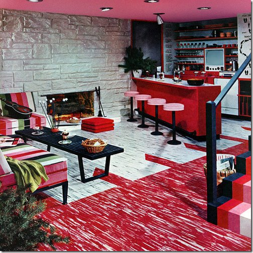
What Not To Do: This is the decor that most people grew up with in the 1950s and 1960s. While mid-century is desired by many today, this is a look that is best forgotten. Compare this decor with the decor below – both from the same time period:
Marian Hall - 1950
This room was also designed in the 1950s, by Marian Hall. This room is timeless, due of course to the use of classical shaped chairs and tables. These again may be antiques, period or reproductions – who can tell? Their lines and shapes are what is important. Though this room is 60 years old, even the colors are amazingly modern – the white walls, the olive greens and sages, the peaches and khakis. This one photograph proves my point more than any other – using antiques will keep your interiors from dating.
Again, What Not To Do: a typical interior that screams 1950s. I actually grew up with a fireplace just like that.
Nancy Lancaster, 1950s
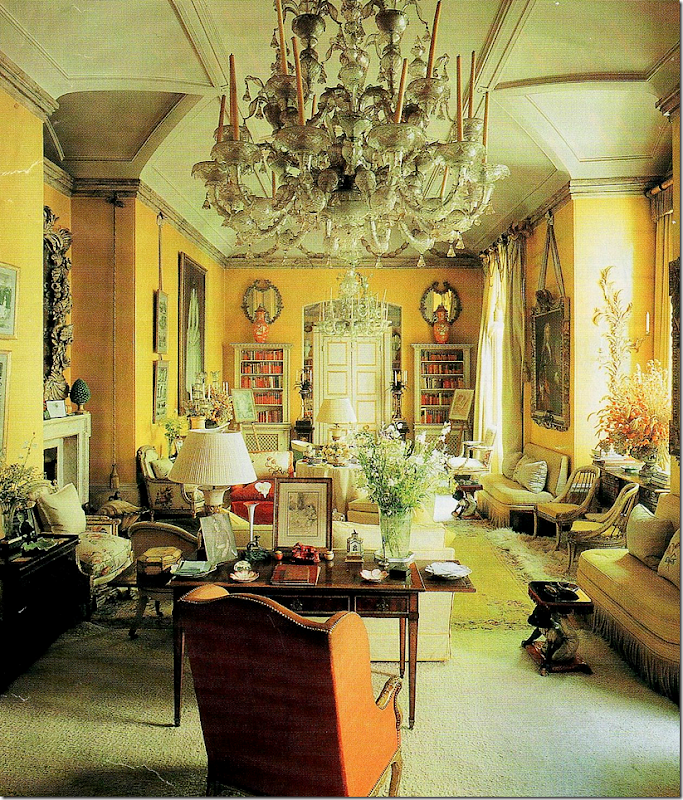
One of the more famous interiors in the history of interior design, the yellow drawing room by Nancy Lancaster which features both English and French antiques in a delightfully cluttered space. Again, utterly timeless – this space is not defined by any decade or style.
Nancy Lanscaster, 1950s
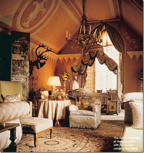
Another 1950’s decor by Nancy Lancaster – her bedroom at Haseley. I adore this room! Again, the antiques, the screen, the bed, the accessories, the rug, all make it timeless and classic.
Michael Taylor, 1950s
Even contemporary design can be timeless. This furniture is not antique, but the shapes and detailing come from the classic: the lamps resemble English barley twists, the side table with its fluting takes it looks from an antique column, the chairs are shaped like Louis XVIs. Here the contemporary furniture is based on the classical which makes it timeless itself. Does the trendy cowhide give you a clue to the decade this room was designed? Michael Taylor – 1950s. Amazing.
Michael Taylor, 1960s
Another design by Michael Taylor. Though most known for his later contemporary work, his earlier work from the 50s on, was more classic. Here – a sitting room is made timeless due to all the French antique furniture (though who is to say it is truly antique or reproductions?) I adore the slipper chairs with the zebra upholstery! Adding a classical element is the tapestry, the lamps, the hanging shelf, the rug – all most likely antiques, or reproductions. Remember: any item over 100 years old is officially an antique, regardless if the antique is actually a reproduction.
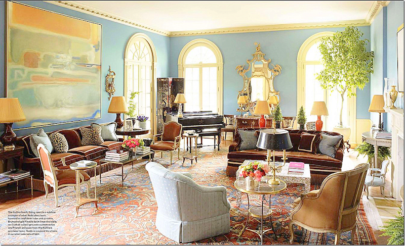
This room recently designed by Miles Redd reminds me of the room above by Michael Taylor. This room is timeless and could have been designed in any decade. The classic chairs and tables, lamps and chests give no clue as to the actually time this room was designed.
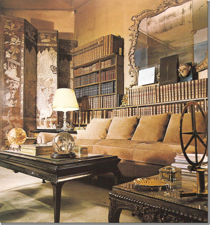
Another timeless design – what decade is this from? Coco Chanel’s French apartment from the 1950s. Notice the comparison to this room below:
Deandra Douglas’ estate - the antique table is similar to Coco Chanel’s. The antique tapestry resembles Chanel’s screen. Both rooms are similar in style, yet they were designed fifty years apart. Again, timeless, classic antiques always make an interior more interesting.
John Saladino
The Master at Using Antiques: One of John Saladino’s most famous designs is this apartment in New York City. Along the back wall, a mirror is layered against a hanging tapestry – a trademark of Saladino’s. The antiques are mixed with traditionally upholstered pieces. As always – it’s the beautiful antiques that Saladino chooses that make his interiors so stunning. For instance, the pair of chairs shown above are so strikingly gorgeous – how could anyone choose contemporary chairs over these? The painted detailing on the chairs, the shaped backs, the curved arms – these chairs add so much interest to the room, it’s hard to imagine the space without them. But….are these truly antiques or new? Remember – it’s not always the provenance that’s important. Sometimes it’s just the design.
John Saladino, Villa di Lemma
John Saladino’s own Villa di Lemma, again a mix of English, French, Italian and Spanish antiques. Each antique is so beautiful and special, one alone would be enough – but an entire room full of this caliber of antiques is stunning. Saladino’s interiors are always warm and welcoming, inviting and interesting. And it’s his use of antiques that create that perfect atmosphere he is so adept at.
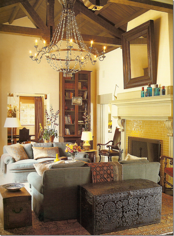
Another view of Saladino’s living room filled with beautiful antiques and contemporary art. Would this room look as beautiful filled with Italian contemporary furniture? The house itself looks like an antique castle but it is from this past century.
Jose Solis Betancourt
This room, designed recently by Jose Solis Betancourt is a combination of contemporary upholstery shapes mixed with antique side chairs and accessories. The mirror, the lamp, the art – are all antiques which makes the room classic and timeless, despites it contemporary feel. Imagine this space without the mirror, the lamp, the chairs - it would be cold and starkly modern. Instead the antiques lend the warmth and beauty. Betancourt studied under the master, John Saladino, and his influence here is very evident: the mirror layered over a hanging textile, the side chair with a waterfall skirt lending a slipcover appearance to it, the lilacs, the mix of new vs. old – is all so very Saladino.
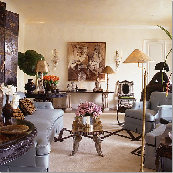
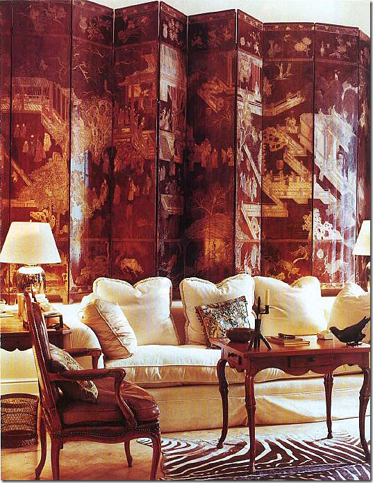 Rose Tarlow, an antiques specialist, decorated her apartment in London over 25 years ago – nothing has been changed since and it still looks as beautiful as the day she created it. The antiques of course give it its timeless appeal – the table, the chairs, the screen, the accessories – nothing dates.
Suzanne Rheinstein
This orangery designed by Suzanne Rheinstein almost twenty years ago, still looks fresh and stylish. Here the antiques are painted which make them slightly less dressy and serious. The classic Brunschwig and Fils chintz is timeless. Slipcovers and apple matting are trendy elements today, though they have been used for centuries in England. The painted screen and hatbox are colorful – not stuffy like antiques are perceived to be. Is this house in the countryside of England? It certainly looks like it, but actually it’s in Virginia. I would decorate a room just like this today and change little, if anything, about it. Rheinstein would disagree with me – she did totally redecorate this room, but I always liked this version more.
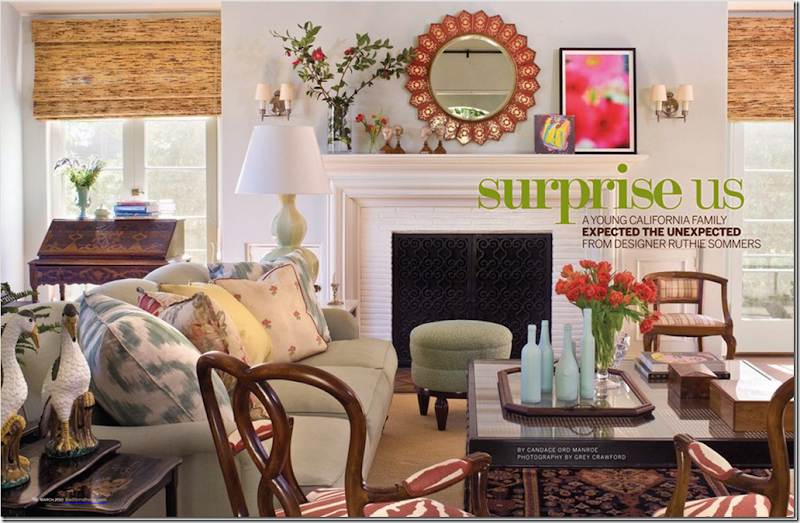
Here, a newly decorated living room from L.A.’s Ruthie Sommers. Classic fabrics – ikats and zebra prints, chintz and embroideries look new and fresh. Yet, the antique pieces are what provide the interest, the warmth: the chinoiserie side tables, the wood arm chairs, the desk, the accessories. This shows how a younger couple can decorate incorporating antiques and still get a hip look for today.
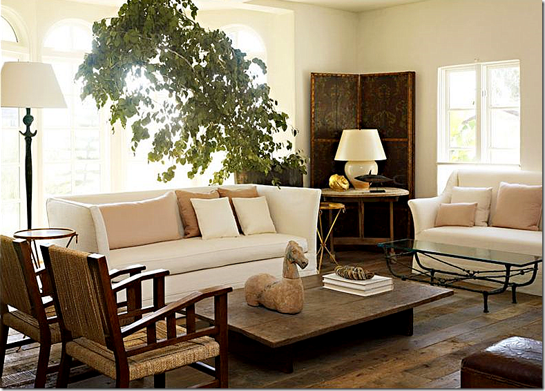
Antiques Don’t Have To Be Fancy: Rough Luxe, the new buzzword in design – mixes the rustic in a stylish way, it heralds the imperfect. Here, LA’s Atelier AM mixes an antique leather screen with chairs from the 30’s. The soft pastel silk pillows are juxtaposed against all the harsh edges. This look, taking its lead from the rustic and sparse Belgian design, is rapidly gaining in popularity. There is something honest about this look – stripped bare of all excesses and frills, its appealing in its simple approach. But don’t think it’s easy to design this way. It takes someone with a keen eye for design, for proportion, for color, to be able to put something together like this and have it been so pleasing.
Hot, hot, hot stylist and interior designer Jill Brinson’s Atlanta house has a Rough Luxe appeal. Her clever mixture of new with old, imperfect antiques, has its roots in Belgian styling. Totally personal – her house is filled with pieces picked for their lines, texture, and uniqueness. The antiques are not necessarily precious but that is the appeal.
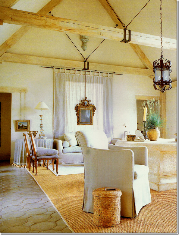
Antique Architectural Elements: Antiques that are important to a room can be structural. Here, antique flooring really adds to the look of this room. The walls, the ceiling, the windows give much atmosphere to this decor – without the structural elements the room would be much less interesting. It all looks so inviting, comfortable and warm due to the weathered patina of the architectural elements.
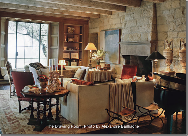
Antiques don’t always have to be furnishings. Here, the walls of the room are antique: the boiserie (paneling), the parquet flooring, the fireplace mantel, the windows. All the building materials are antique or are made to look antique, creating a room that is incredibly beautiful. This house, home to a famous Belgian fashion designer, is the height of timeless decorating. It is impossible to date this room – was it decorated in the 90s or the 70s ? Is the house new or a century old? Will the design looked dated in 20 more years? Of course not. This room is perfection and one of the prettiest designed rooms in recent memory.
Architectural Elements Don’t Have To Be Old To Look Old: Here, in contrast to the above room, the building elements of this house are not antique, but are made to look old: the paneling, the ceiling, the windows. The rustic antiques, the tables, the stools, all add that warm touch to the room that you just can’t replicate with store bought furniture. So charming!
Unfortunately, we can’t all afford to live in glorious old houses like this. The appeal of this house is its patina and its architecture. The aged terra cotta tiled floor, the thick stucco walls, the arched windows and doors, the shutters - it’s all so romantic, even inviting though there is barely any furniture.
Faking Age With Antique Architectural Elements IS Possible: The owner of Chateau Domingue remodeled her house to make it look centuries old. All the patina was added using architectural salvage from her shop. The walls were once sheetrock but now they are clad in antique stone which was brought over from Europe. The flooring is also aged, brought over from Europe. New can be made to look old – and it is especially effective when the salvage is antique.
Another new kitchen made to look old. All the cabinets were removed and replaced with antique consoles and dressers. This kitchen is by Houstonian interior designer Jane Moore. Additionally, her furniture is also antique: the dining room table is Swedish, the upholstery pieces are antique frames. This is just so much more appealing than a contemporary kitchen with rows of cabinetry.
I love white rooms – I think they are wonderful, especially white rooms filled with white linen slipcovers. While this room is wonderfully designed, it not one I would choose for myself. Why? There are no antiques, no antique reproductions, nothing that warms up the room, makes it cozy looking and inviting – two things I need to see in a room to make it appeal to me. This room screams 2000’s. In 10 and 20 years, it will be dated and I assume, the decor will be long gone, changed by owners looking for something less obvious.
And another white room that does nothing for me emotionally, except leave me cold. One glance and it’s done with. There’s nothing to hold your interest – all the wood looks the same, an anemic pencil color, there is nothing romantic here. The art work is itself puzzling – one is left wondering when the movie is starting.
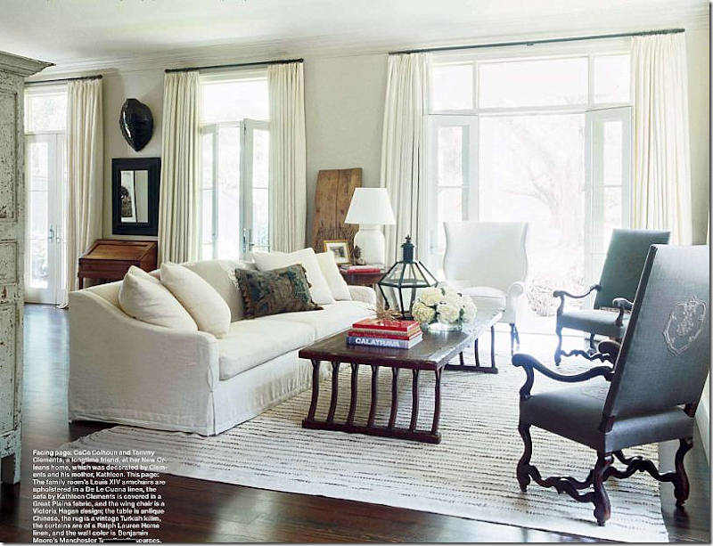 By contrast, this white room is everything the other two above aren’t. It’s interesting and warm, inviting. The two chairs `re antique, as is the wonderful Chinese coffee table. These pieces, along with other accessories around the room make this space more timeless and less contemporary. Very beautiful.
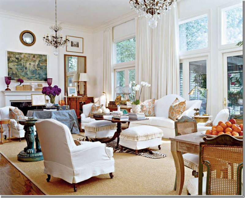
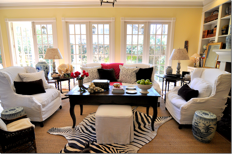
Another white room that appeals. This room is so interesting, so vibrant with all its layers and clutter. Your eye jumps from table to table to mirror to art work, to fabric to stacks of books and then it starts all over again – wondering what was missed on the first glance. The room is alive, it looks like someone actually lives here, drinks coffee here, reads a newspaper here, plays cards and eats a snack here. It’s cozy, it’s warm, it’s inviting – everything you would want in a room. It’s a large room made smaller by all the furniture. There are so many different textures – the seagrass, the zebra, the fringe, the silk taffeta, the smooth crystals, the soft curtains – it might be difficult to keep your hands to yourself and not caress all the different materials. This room is one of my favorite of last year and I have included it in each Top Ten Design Element yet: linen, slipcovers, seagrass, curtains, light fixture, wall decor – and now antiques. How far will it go – will it qualify for all Top Ten Elements? Stay tuned!
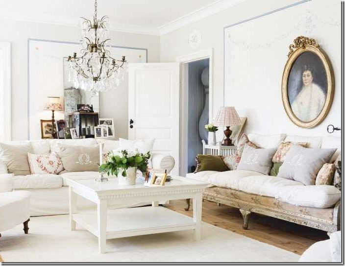
Another beautiful white room, warmed by the antiques – the antique sofa, the large, wonderful oval portrait and the Mora clock peeking in from the next room. Besides being all white, the room is also Swedish, another personal favorite of mine. Imagine this room without the antique sofa or portrait – it wouldn’t be quite same, would it?
This white room by Kay O’Toole is all antiques – of course - O’Toole is an antique dealer. The fabric on the chairs is old gray and white Fortuny. For years I lusted after this apartment – every single room was glamorous!
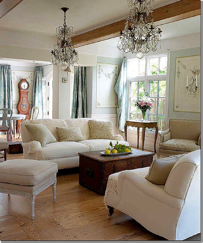
Another Swedish room, with an antique chest acting as a coffee table, antique tables, chairs, and Mora clock. The crystal sconces and chandeliers add an extra touch here. Again, the antiques warm the room with their patina, which then adds another layer that catches the eye when walking through the space.
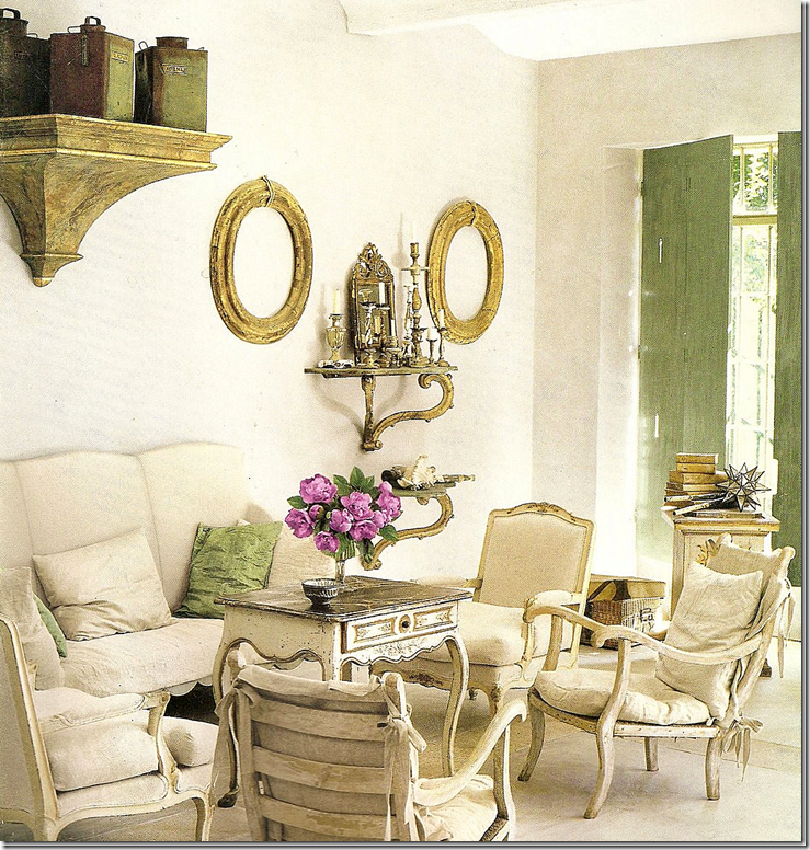
All white with a touch of green in the shutters and pillows. What a wonderful living room! The two empty gold frames add a touch of whimsy, while the furniture showcases country French at its best. I love the mix of chairs – two pairs, one is dressy, the other is wonderfully slouchy. These antiques are the opposite of the “don’t touch” antiques of yesterdays. Instead, these invite a lingering of the hand over the their smooth, painted woods. Beautiful!
Gerrie Bremermann designs an all white room using silk taffeta for curtains and lots of antiques. Living in New Orleans and owning her own antiques shop insures that Bremermann’s clients get large doses of patina in their rooms. Typical of a Bremermann room, the majority of antiques are French.
My own family room before I painted it gray. I advise clients to buy at least one antique piece of furniture for each room. This then becomes the anchor of the room. One can decorate around it, change fabrics and accessories, without having to ever replace the furniture. Here, my antique dough table is used as a coffee table. The two barley twist gate legs are from the 20s probably. They are so heavy, unlike new tables, plus I got them for a steal - $300 each from a dealer in Houston.
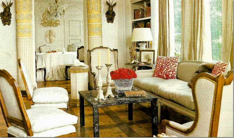
This all white/cream room is so feminine – thanks to the Swedish and French antiques. I love how the original upholstery is duplicated by the use of tiny nailheads that are usually covered by trim.
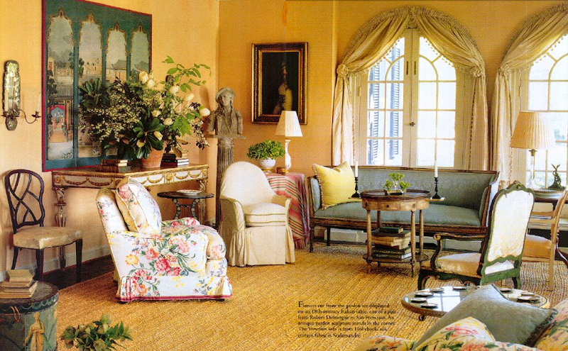
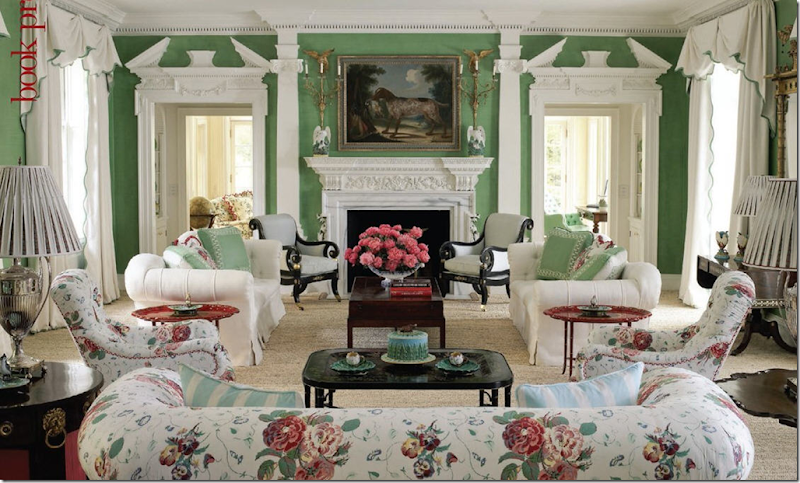
Color: This fabulously bright living room is timeless – due to the antique furniture and to the architecture of the room with all the moldings. The fabrics are classic chintz. When was this designed?
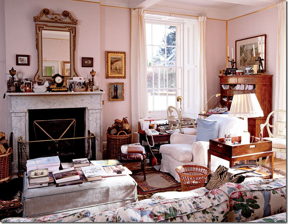 This sitting room reminds of the same room above – this is where the Dowager Duchess of Devonshire moved to after her husband died. It’s a smaller, much more cluttered and lived-in version of the Diamond and Baratta room above.
Michael Smith’s rooms are classic – always filled with wonderful antique furniture and accessories. This room is a personal favorite. Imagine if the chairs, the trunks, the desk were replaced with contemporary designs!
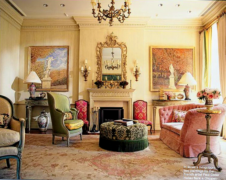
Charlotte Moss’ living room has beautiful matching consoles and antique chairs and tables. The rug! She has a wonderful eye for creating warm and inviting interiors using hand picked antiques.
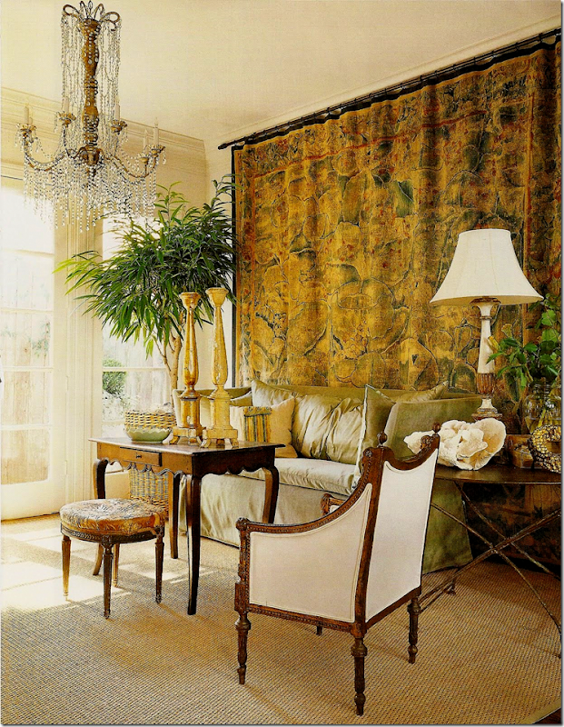 Everything here but the sofa is antique. The owner is antique dealer Donna Brown of The Gray Door in Houston. Her townhouse is fabulous! The chandelier and the tapestry are to die for.
Donna Brown’s kitchen and family room. She replaced a standard kitchen with antique elements such as this office file. I love the stool and the wine tasting table.
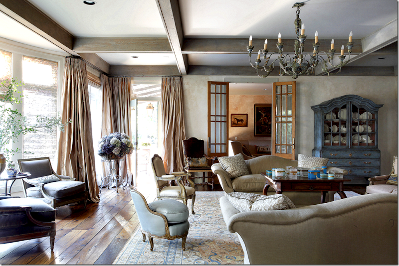 Babs Watkins, Julie Baker and Eleanor Cummings all shared the design credit on this house. Without a doubt the antique furniture and accessories made this room beautiful. Hard to imagine what it would look like with contemporary furnishings.
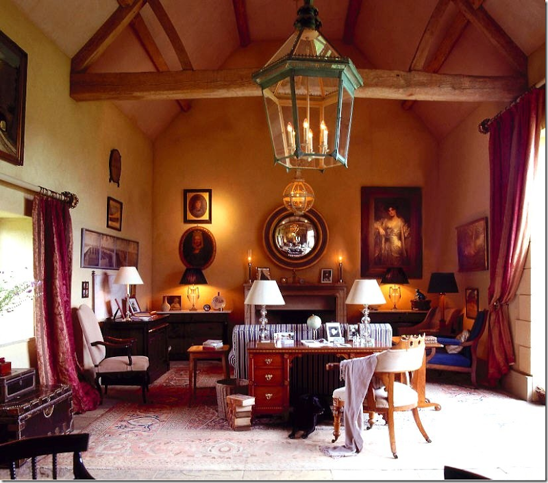
The real deal: this country house in England is filled with English antiques.

Another mixture of contemporary and antique. The antiques make the room more interesting and add much needed texture.
I’ve always loved this room with the old French leather chairs and the antique tables. Nothing is too fine or unaffordable here which helps make the room that much more appealing.
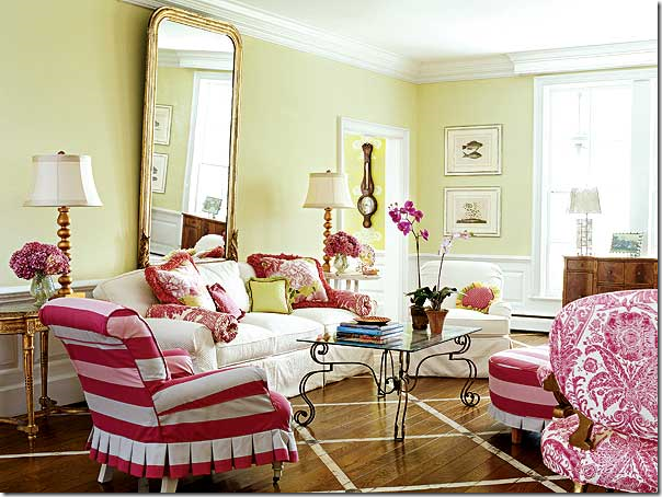
Antiques can be fun – not stuffy. The large gilt Louis Philippe mirror is almost playful here in a room filled with lime green and hot pink.
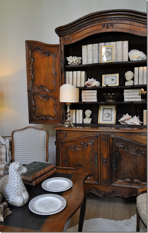
When starting out, try to buy one big piece of antique furniture for each room. If money is an issue, then save up instead of settling. I waited years and years (15 to be exact) to be able to afford a Buffet a Deux for my living room. I used funds from my business to pay for it myself so that my husband couldn’t interfere!! Now that I have this piece, it will always be in my house – somewhere – and hopefully in my daughter’s house one day.
One fabulous antique is all a room needs. The chairs could be new or old here, but it doesn’t matter when a such a fabulous antique like this armoire is present. The chandelier is quite exquisite too.
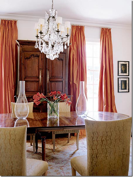 Mixing contemporary and the antique. Always try to buy one major antique for each room. It will stay with you for a lifetime. This armoire grounds the room, makes it seem more special, warm, less modern.
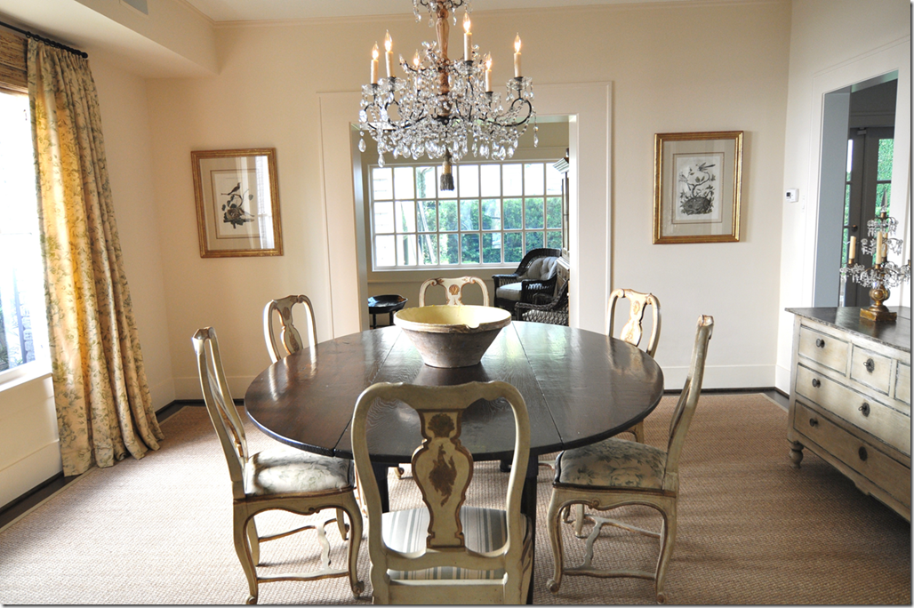
Gorgeous, gorgeous, gorgeous antique table and chairs. Beyond gorgeous.
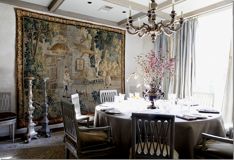
Another beautiful dining room with antique Swedish chairs and a fabulous tapestry. Here, the antique tapestry becomes the important piece of furniture. Perfection!
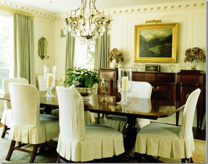
Granny’s dining room furniture made youthful by pleated slipcovers. If you don’t want all this brown, try painting your inherited dining room and buffet.
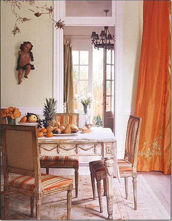
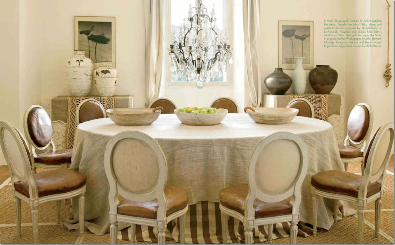 I adore this dining room with its large linen covered skirted table. But the antique leather French chairs make such a huge statement here.
Beautiful antique chairs, chandelier and Swedish chest mix with Bennison fabrics. The table may be old or new – it really doesn’t matter when so many gorgeous antiques are around.
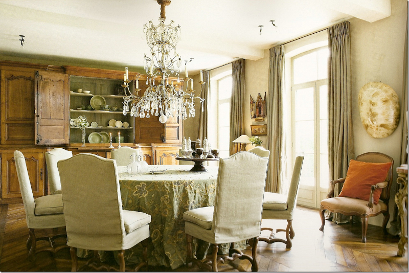
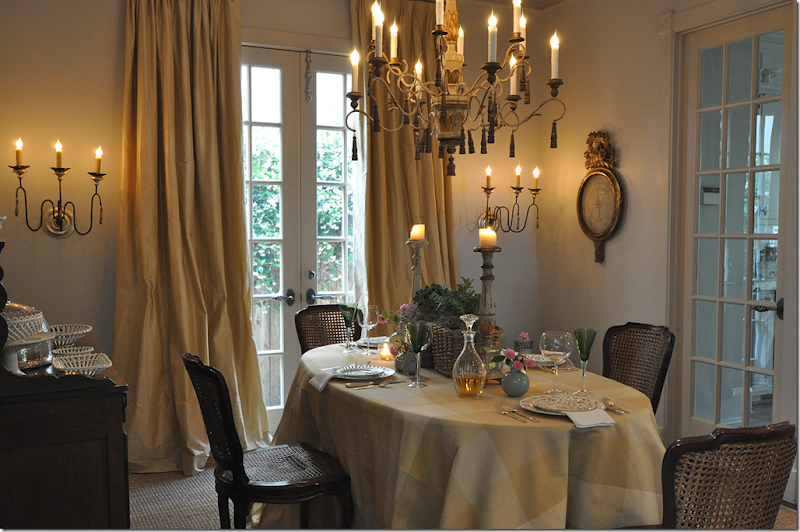
In my dining room, my breakfront is antique and is the anchoring piece. The chairs are vintage, not antique. The French barometer is antique, bought from 1st Dibs. But the chandelier – I don’t know if it is antique or not. I bought it from a friend who said it is, but I have my doubts. It doesn’t matter to me though, I really like it and it looks like an antique, which is good enough for me. The sconces are definitely new, but again, they have an antique look – it’s the style I was going after, not the provenance.
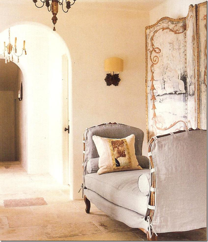
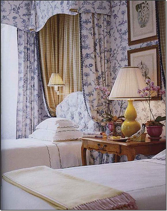
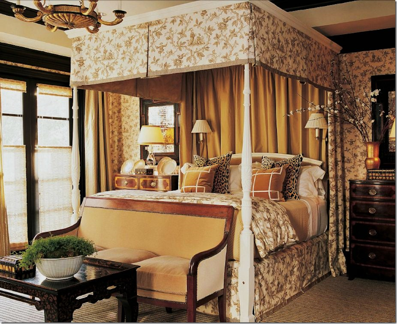 This bedroom by Randy Powers of Houston is a mixture of fine antiques and reproductions. The tea table is new, yet the side tables are antique, as are the mirrors and the accessories. The settee is antique, but the bed is new – repainted by Powers. I love this fabric, it’s one of my favorite toiles. The side tables add interest – being antique they are both different, yet look similar. Such a beautiful room.

In this bedroom, the antique table makes a huge statement. The fruitwood is so warm. It grounds all the white. Beautiful!
Suzanne Rheinstein designed this bedroom years and years ago – yet it still seems relevant for today. The antiques are beautiful, the bed, the chairs, the mirrors, the art work! I would love to have this bedroom – it’s gorgeous and timeless.
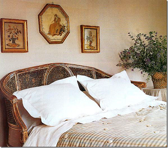
A headboard made of a settee – to die for! One of my favorites from a long time ago.
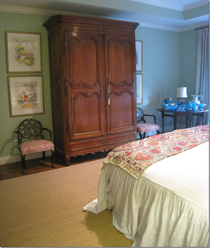
Again, one antique piece of furniture is enough: I bought this armoire for my bedroom and know that it will always have a place in my home. It makes the room.
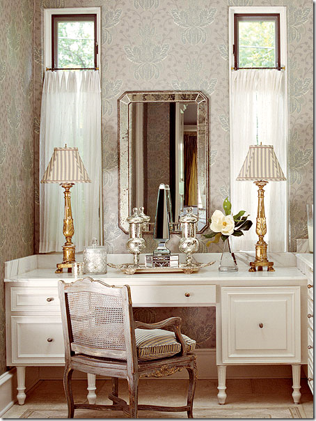
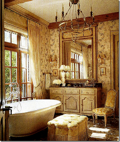 Antiques are important even in bathrooms: the enfilade is so much prettier than a built in cabinet. The antique chandelier is gorgeous. Powder rooms are also great places to add an antique or two.
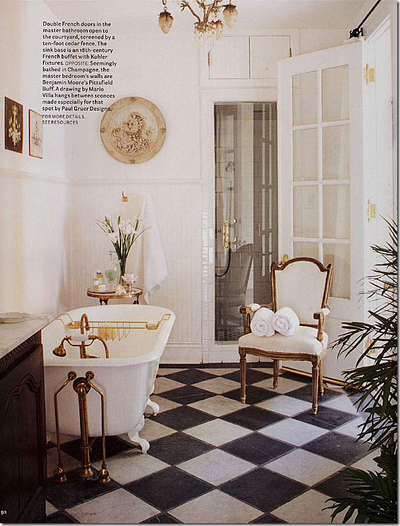
One important antique – the chair (or is it a new reproduction) adds much romance to this bathroom. The lamps are a better choice than bathroom styled sconces too.
The chair alone would add the perfect touch, but the cabinet, the tub, the hardware, the light fixture, the art work, all antiques, make this bathroom special.
There are now seven of the Top Ten Design Elements posted. Three more to go! Keep a look out for the remaining elements coming soon. As always, thank you for your continued support!

![image_thumb1[1] image_thumb1[1]](http://lh3.ggpht.com/_t8-Y4w1UKrc/TIIJE6KtjDI/AAAAAAAA30E/_zz_TPKHjZM/image_thumb112.png?imgmax=800)
![image_thumb3[1] image_thumb3[1]](https://blogger.googleusercontent.com/img/b/R29vZ2xl/AVvXsEj9CIVOtL92j4TYs2kvoRn3Zk1io7T2yBJmvZEEun-PjHqCgIzHMtQBvyzVpZg2FGiN3doK12i_1Kc1d1cNt35ciltshgWk4V5Ni0V7zZYR1AG3nh5qE0692Km2EfdpwJOdczC5quE-_SEM/?imgmax=800)




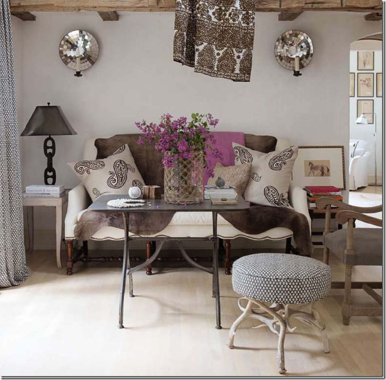
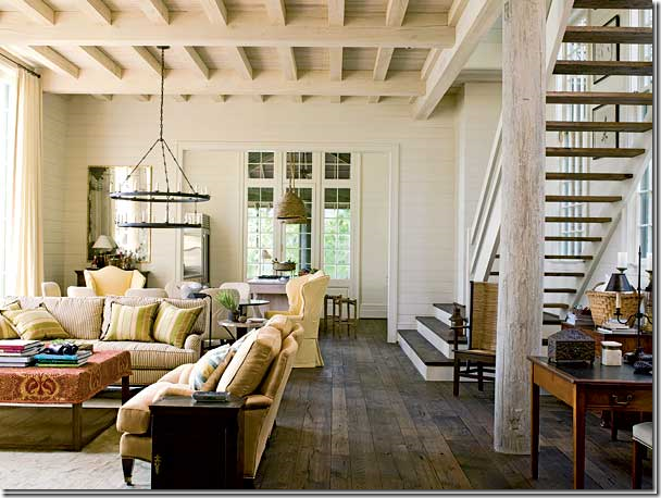


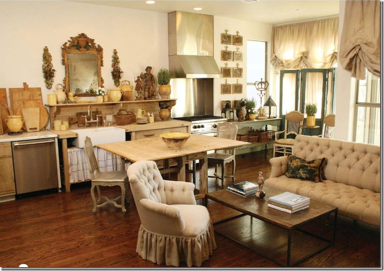

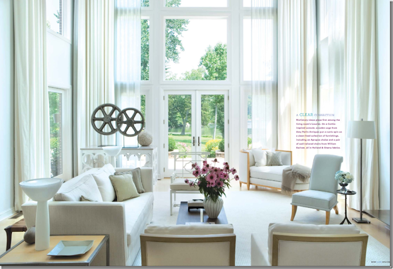





No comments:
Post a Comment